human AI marketing
the brand guide.
One system: a hand-drawn mark, warm paper, quiet teal, and a voice that sounds like a neighbor.
01
why we exist.
The short version, before any pixels.
Human service. AI speed.
We make world-class marketing accessible to local businesses by pairing generative-AI speed with human white-glove service. You talk. We build. In days, not quarters — delivered by a real person you know by name, in Batavia, Illinois.
Shoshin · 初心 · beginner's mind
Approach every project, client, and tool as if for the first time. Curiosity over expertise. Questions over answers.
Wabi-sabi · 侘寂 · beauty in imperfection
Asymmetry, weathering, the visible hand of the maker. The smudge and the off-kilter line are evidence we were here.
Human first
Every client has a named human contact. AI never answers a client unsupervised.
Hometown loyalty
Batavia, Geneva, St. Charles before anywhere else.
Light speed
If it takes a competitor six weeks, our target is six days.
Honest pricing
Real compute plus real hours. No agency tax.
Apprentice-built
Interns aren't a discount — we train, mentor, and credit them publicly.
Quietly powerful tech
The client never sees the gears. The work looks effortless.
02
the mark.
An ensō drawn in one motion, with a human signal running through it. It ships as three size-optimized drawings — full anatomy, usage mocks, and downloadable files live on the identity page.
- The circle
- Deliberately imperfect — the community we work inside and the beginner's mind we bring to it. Never corrected into a perfect circle.
- The wave
- A hand-drawn tilde — a voice, a heartbeat, a wavelength. The asymmetry is the point.
- Clear space
- One quarter of the mark's diameter on every side. No type, no photos, no edges.
03
the name.
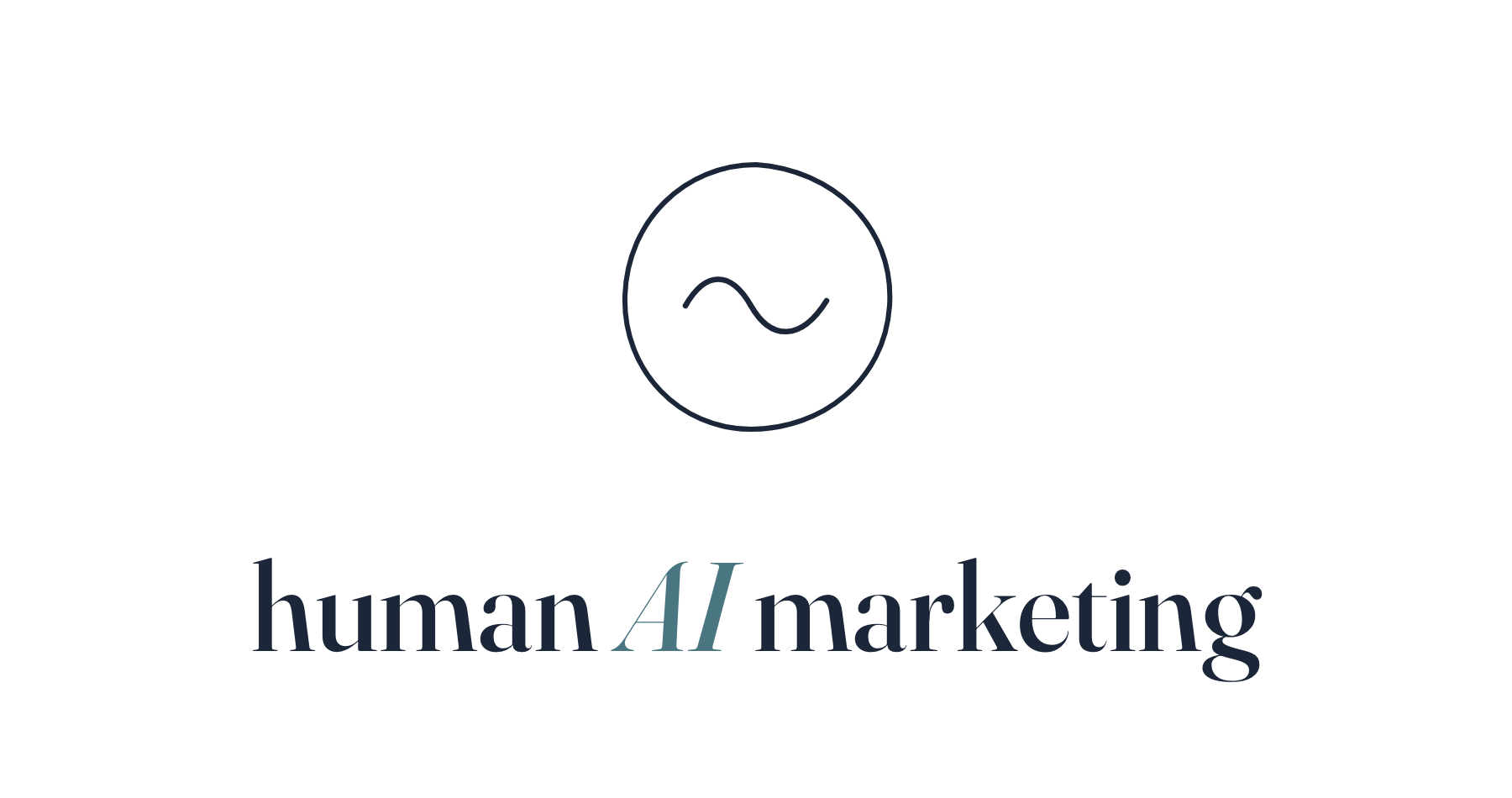
Fraunces, lowercase, with the AI set italic in teal. Always human AI marketing — never all-caps, never "Human Ai Marketing." The mark sits left of the name, or above it when centered.
Primary lockup — horizontal
Stacked — centered contexts only
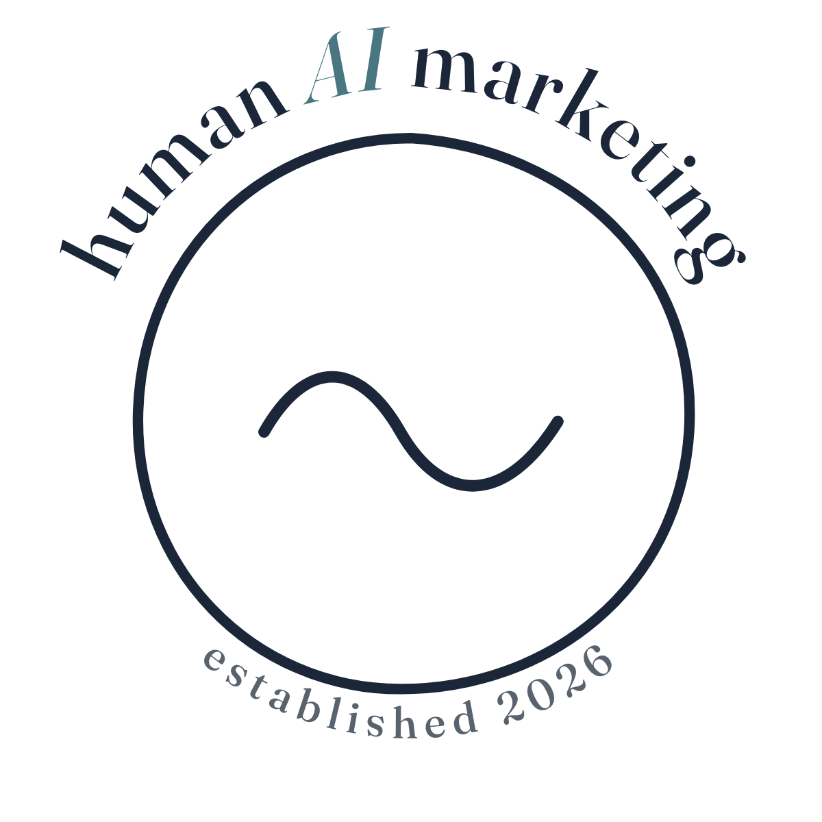
Monogram — tight spaces, internal pages
04
the palette.
Small on purpose: two warm off-whites, ink, one quiet teal, and a deep sumi for emphasis. No orange, no bright cyan, no gradients, no drop shadows. When in doubt: more of the base color, less of everything else.
Base and lift
Pick one per page and hold it: Paper-as-base with Bone lifts (long reads, the handbook), or Bone-as-base with Paper lifts (marketing, photography-led pages). Never alternate within one document.
Teal is earned
Teal carries the AI in the wordmark and one accent word per headline — italic, never two. At display sizes over busy backgrounds, step down to teal-deep #355864.
05
the type.
Three faces, three jobs. Fraunces carries the headlines — SemiBold, so they land with weight. Inter does the reading. Caveat is the pen in the margin.
DISPLAYFraunces 600
1.04 line height
marketing, made by hand.
HEADINGFraunces 600
a real person writes back.
DECKFraunces 300
The quiet line under a heavy headline.
BODYInter 400
16px minimum
Plainspoken and specific. Name streets, names, businesses, and timeframes. Contractions welcome; buzzwords are not.
HANDCaveat
— a note in the margin, used sparingly.
- Headlines: lowercase or sentence case, ending with a period. Never all-caps except short labels (≤ 4 words) in supporting roles.
- Headlines are bold by default (600); inside a paragraph, emphasize with italic, not bold.
- One italic teal accent word per headline — never two.
- Line height tightens as size grows: 1.6 body, 1.1 headings, ~1.04 display.
06
the surface.
Every page is paper. A barely-there speckle gives the surface tooth — felt more than seen. This page is wearing it at the official strength.
07
the photographs.
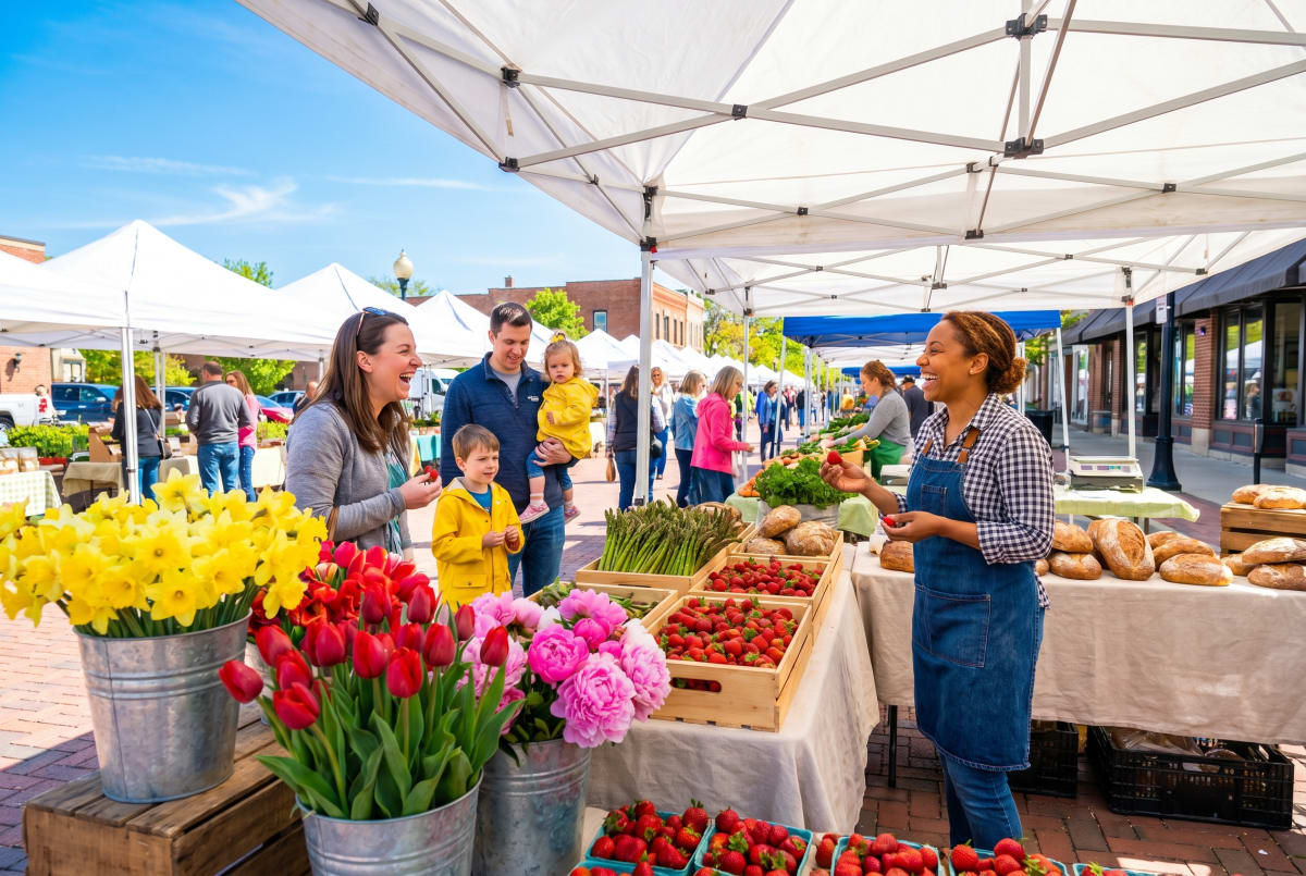
Photography is the most beautiful thing on the page; the interface gets out of the way.
08
the voice.
Plainspoken, confident, specific, warm. A trusted neighbor who happens to have a computer science degree — never a pitch deck.
✓ on brand
"We rebuilt your site over the weekend. Here's the before and after."
"A real person in Batavia reads your note and writes back within one business day."
"Squarespace was fine in 2016. It's costing you money now."
✗ off brand
"We leverage cutting-edge AI to revolutionize your digital presence."
"Our world-class team of experts is standing by 24/7."
"Unlock synergistic ROI with our omnichannel growth solutions."
09
leave it alone.
The imperfection is the signature. Most damage comes from trying to help.
Human AI!
10
the system.
Logo downloads first — PNG on transparent backgrounds, ready for decks, documents, and print. For losslessly scalable SVGs, use the identity page.